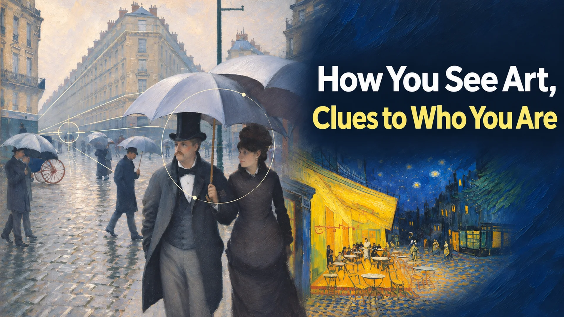
The 19th-century Impressionists induced the audience’s active visual participation through “arbitrary viewpoints” that broke away from fixed perspective and the technique of “color separation” that avoided mixing paint. These pictorial experiments align with the brain’s visual processing stages as explained by contemporary research in neuroaesthetics. The brain processes visual information in three stages—sensory processing within milliseconds, emotional appraisal, and meaning integration—forming preferences based on individual cognitive traits and dispositions. By analyzing how I react to the visual uncertainty and color interactions that Impressionist works intentionally left unresolved, I can objectively explore my unique perceptual habits and emotional patterns, ranging from how I engage in relationships with others to my color preferences.
Distorted Viewpoints and Distance: The Cognitive Difference Between the ‘Watching Gaze’ and ‘Immersion’
While traditional paintings used a fixed perspective to depict an orderly world, Impressionist painters intentionally distorted it. Gustave Caillebotte and Edgar Degas introduced arbitrary viewpoints to their canvases by adopting photographic cropping and the asymmetrical composition of Japanese ukiyo-e woodblock prints 12.
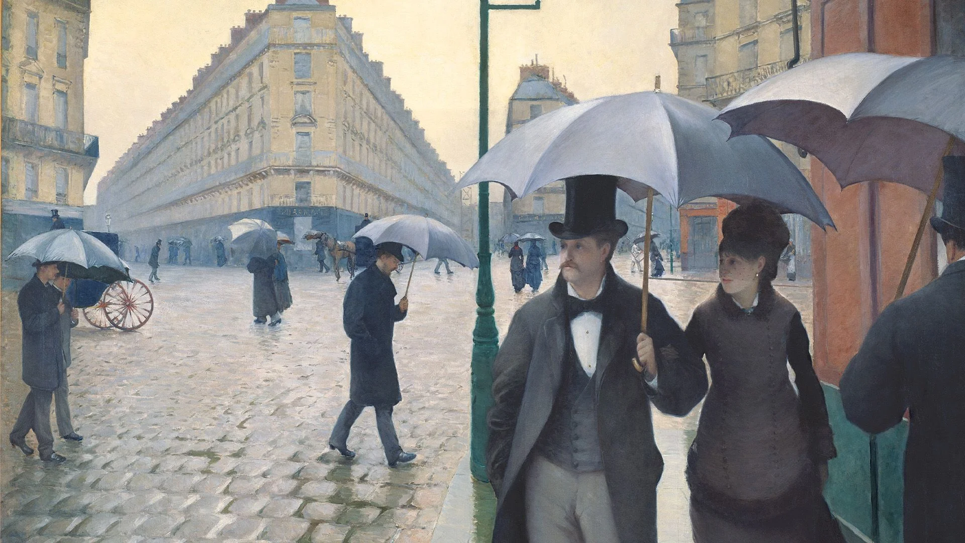
Caillebotte, in particular, strictly adhered to traditional linear perspective while dramatically exaggerating it, employing high, abnormal viewpoints such as balconies and techniques that cut off figures 1. In works like his “Paris Street; Rainy Day” and “The Floor Scrapers,” the exaggerated linear perspective expands the spatial depth of the canvas. This induces a sense of immersion that pushes the viewer into the depicted space, while simultaneously establishing a “watching gaze” where the figures seem unaware of the viewer’s presence, each existing in their own isolated space 1.
Examining immediate psychological reactions when viewing works by Caillebotte or Degas allows us to gauge our own perceptual patterns. This involves checking whether, when confronted with distorted viewpoints and fragmented frames, one tends to make eye contact with the figures and enter their space, or adopts the attitude of an observer looking at the situation from a distance. Since the cropping and asymmetric composition introduced by Impressionism function as devices visualizing the fragmentary nature and alienation of the modern urban environment 1, the psychological distance maintained by the audience within this incomplete visual context serves as a clue reflecting my habits in interpersonal relationships and external stimulus processing.
Pointillism and Optical Mixing: How the Brain Completes Color
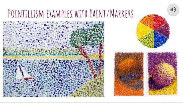
The core of color analysis lies in Neo-Impressionism (pointillism). Neo-Impressionist painters, such as Georges Seurat, chose the method of placing small dots of pure color on the canvas to prevent a loss of saturation that occurred when mixing paints on a palette 34.
| Category | Impressionism (Early Impressionists) | Neo-Impressionism (Pointillism / Divisionism) |
|---|---|---|
| Paint Mixing Method | Aimed for optical mixing where colors blended via light on the canvas, using short, rapid brushstrokes. | Avoided mixing paints on the palette, applying dots of pure color to the canvas to induce optical mixing in the viewer’s gaze. |
| Visual Goal | Captured instantaneous changes in light and subjective impressions. | Pursued a permanent and accurate expression of light and color by separating saturation and brightness. |
| Knowledge Basis | Observation of changes in natural light; influence of the asymmetric composition of Japanese prints. | Construction of a systematic and objective visual order based on scientific color theory. |
Seurat called this “Chromo-luminarism” 3. He applied Ogden Rood’s principles of additive mixing of light to pigments and utilized Michel Eugène Chevreul’s principle of simultaneous contrast to place pigments side by side 4. Seurat’s masterpiece “A Sunday Afternoon on the Island of La Grande Jatte” appears as a swirl of scattered dots when viewed from a close distance, but as the viewer steps back, the brain integrates the individual color dots into one, perceiving them as vibrant colors 4.
In this process, the viewer’s eyes and brain act as the “palette” that performs the final mixing of colors 34. The visual completeness of the painting becomes dependent on my visual cortex processing. By observing whether this optical mixing process brings cognitive comfort and fluency, or causes discomfort by making the segmented state of individual dots noticeable, one can discern differences in cognitive dispositions, such as a tendency toward macro-integration versus sensitivity to micro-details.
Simultaneous Contrast and Complementary Colors: Emotional Arousal and Physiological Response
Colors are not perceived uniformly according to physical wavelengths; rather, they are governed by the phenomenon of “simultaneous contrast,” where the brain reconstructs them based on the surrounding environment 35. Michel Chevreul proposed the principle that when two colors are placed side by side, they interact to alter the observer’s perception, which greatly influenced Impressionist painters 5.
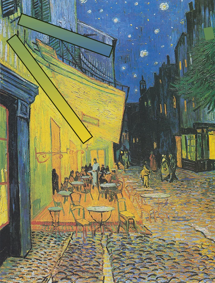
The strongest effect appears in the relationship between complementary colors that face each other on Newton’s color wheel. When red and green, or blue and yellow, meet, modern physiological mechanisms take effect: the retina’s cone cells become overloaded and fatigued by the specific colors, causing complementary colors to appear in the surrounding areas 5. Vincent van Gogh maximized this effect artistically in Arles in 1888.
- Terrace Cafe at Night: He brought life to the scene by enhancing each other through the complementary contrast of yellow and blue 5.
- The Night Café: He created an intentionally unpleasant tension for the audience by contrasting red and green. Van Gogh stated in a letter to his brother Theo, “I tried to express the terrible passions of humanity by means of red and green” 5.
Whether one feels vibrancy when complementary colors clash extremely, or perceives it as a psychological stimulus causing unpleasant tension, serves as a crucial criterion showing how color interacts with cognitive traits and emotional responses.
Reading the Mechanism of Taste through Neuroaesthetics: How Does the Brain Calculate Preferences?
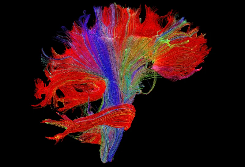
Like and dislike regarding color and form are not merely matters of preference but the result of neurological calculations in the brain. According to research in neuroaesthetics, aesthetic judgment is processed in three stages: ‘sensory capture’ that scans visual information, ‘emotional appraisal’ that yields emotional value through the limbic system, and ‘meaning integration’ that incorporates memory and context 6.
Research using neuroimaging techniques has confirmed that the brain’s reward centers are activated and dopamine is secreted when receiving beautiful stimuli 6. Aesthetic preference provides a physical reward effect to the brain, and as this response repeats, it solidifies into an individual’s fixed ‘taste.’
According to research and frameworks related to neuroaesthetics, color and form preferences correspond to cognitive traits as follows:
| Cognitive Trait and Disposition | Preference Tendency and Elicited Emotion | Neuroaesthetic Explanation |
|---|---|---|
| Saturation and Brightness | High saturation / Low saturation (grayscale) | High saturation tends to induce vibrancy and positive emotions, but experts may prefer complex color combinations with low saturation 6 |
| Color Temperature | Warm colors / Cool colors | Warm colors (red, yellow) tend to induce arousal and energy, while cool colors (blue, green) tend to induce calmness and stability 6 |
| Perceptual Fluency | Symmetrical forms and proportions close to the golden ratio | Symmetrical forms are preferred as they increase the brain’s processing efficiency, and golden ratio proportions activate reward centers more strongly 6 |
Furthermore, from an evolutionary biology perspective, red acts as an immediate signal attracting attention by recognizing survival-related information such as skin color changes, while blue symbolizes a safe environment and provides calmness 6. These characteristics help understand how my emotional filter processes and rewards color information.
Practical Protocol: Using Impressionist Appreciation to Check Perceptual Habits
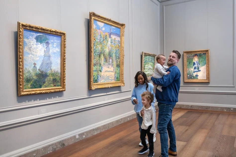
You can use the appreciation of Impressionist works as a practical cognitive response tracking protocol. Stand before a museum piece or high-resolution image and record your internal reactions in the following order.
- First Impression Stage (Sensory Capture and Emotional Appraisal): When viewing works like Caillebotte’s “Paris Street; Rainy Day” with its exaggerated linear perspective from a balcony viewpoint, do you feel a ‘psychological immersion’ as if you are in the same space as the figures, or do you maintain psychological distance as an ‘observer’? When stepping back to view a pointillist canvas by Seurat, recognize the cognitive comfort in the moment your brain integrates the colors into one.
- Color Sensitivity Test: Focus on parts where the simultaneous contrast of red and green is extremely applied, such as in Van Gogh’s “The Night Café.” When afterimages of complementary colors occur due to physiological retinal overloading, do you interpret them as energy and vibrancy, or assess them as unpleasant tension? Record which palette, whether the warm and highly saturated colors aligned with an extroverted disposition, or the cool and desaturated colors aligned with an introverted disposition, provides a more immediate sense of comfort or stimulation.
- Cognitive Fluency Analysis: Determine whether the brain shows an immediate reward response (increased preference) when detecting symmetrical structures or ratios close to the golden ratio in the canvas, or whether you feel greater visual interest in irregular forms.
Impressionist works are visual experiments that scattered colors on the canvas and delegated the completion of the picture to the observer’s visual cortex. The process of tracking how the brain’s reward circuits process and interpret the boundaries of dots, lines, and complementary colors becomes a useful tool that clearly reveals my perceptual filter, consisting of emotional responses and cognitive dispositions.
References
- Caillebotte · arthitparade.net↩
- Impressionism · educba.com↩
- Neo-Impressionism: Painting Movement · visual-arts-cork.com↩
- ↩
- Simultaneous Contrast · webexhibits.org↩
- Visual Aesthetics: Why Your Brain Decides What's Beautiful · weandthecolor.com↩